Dec 2024
Packaging Design
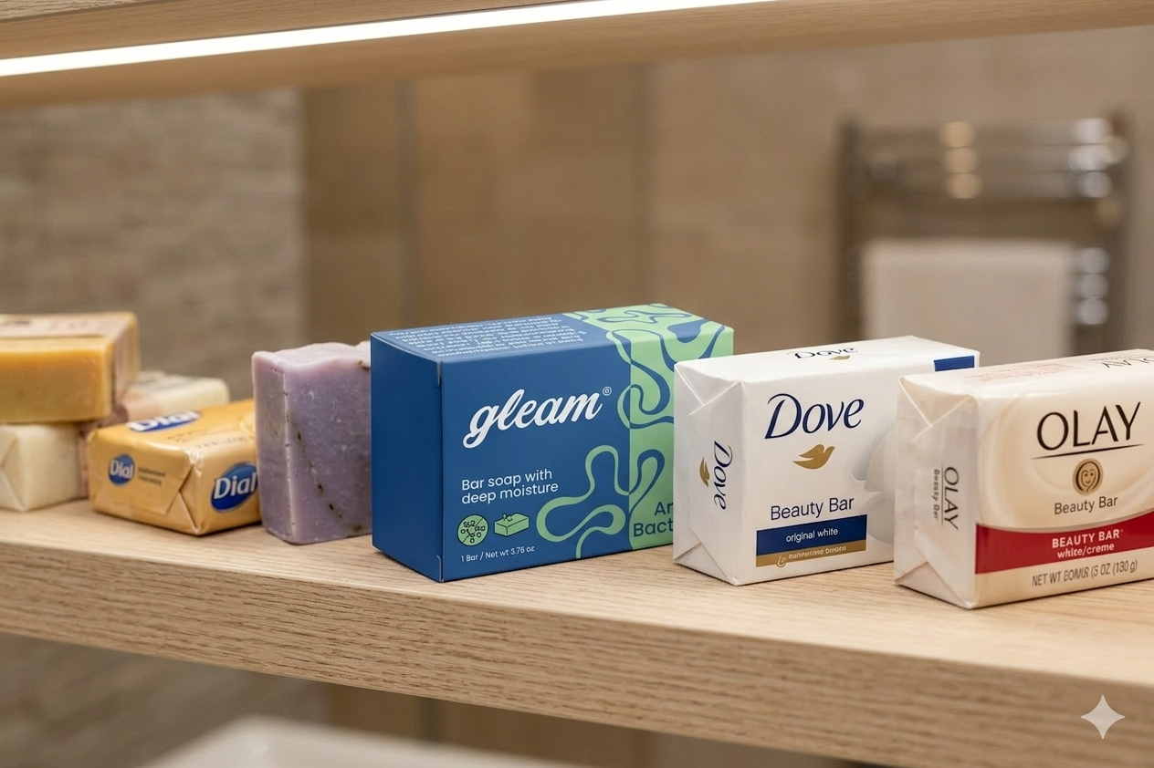
Gleam Soap Packaging
Gleam is a fictional brand of bar soap that came with a logo—but no visual identity beyond that. For this project, the challenge was to create packaging that could hold its own next to big-name competitors.

Clean Doesn’t Mean Boring

I started with a deep dive into the soap aisle—documenting how leading brands approach color, typography, and messaging. What stood out was a sea of white packaging and overly minimal branding, which often felt either too clinical or too dated.
Since Gleam didn’t have any brand guidelines beyond the logo, I had the freedom to explore and define what the brand could be.

I focused on capturing the natural, fluid essence of soap lather. Early explorations leaned into soft curves and loose, flowing lines—shapes that evoked the movement of water and the tactile experience of soap in use. Through refinement, the design evolved to feel both intentional and effortless. Pushed the identity closer to something that felt clean, modern and reflects how it feels to use.
Rub a Dub Dub
The final design pairs a deep navy blue base with soft, pastel accents to strike a balance between bold shelf presence and gentle skincare cues. The navy gives the brand a recognizable foundation across different scent variations, and contrasts well with the competition.
Typography is set in Poppins, a clean and clear sans serif chosen to complement the rounded, friendly logo while keeping the text readable and structured.
On the front, minimal but clear product descriptors and iconography make it easy for the customer to quickly understand the function of the soap (e.g., antibacterial, shea butter, etc.).
The result is a packaging system that feels elevated, fun, and functional — designed to pop on the shelf without sacrificing clarity or care.
Look at it Gleam!