May 2025
Brand Identity + Marketing Collateral
Summit Film Festival
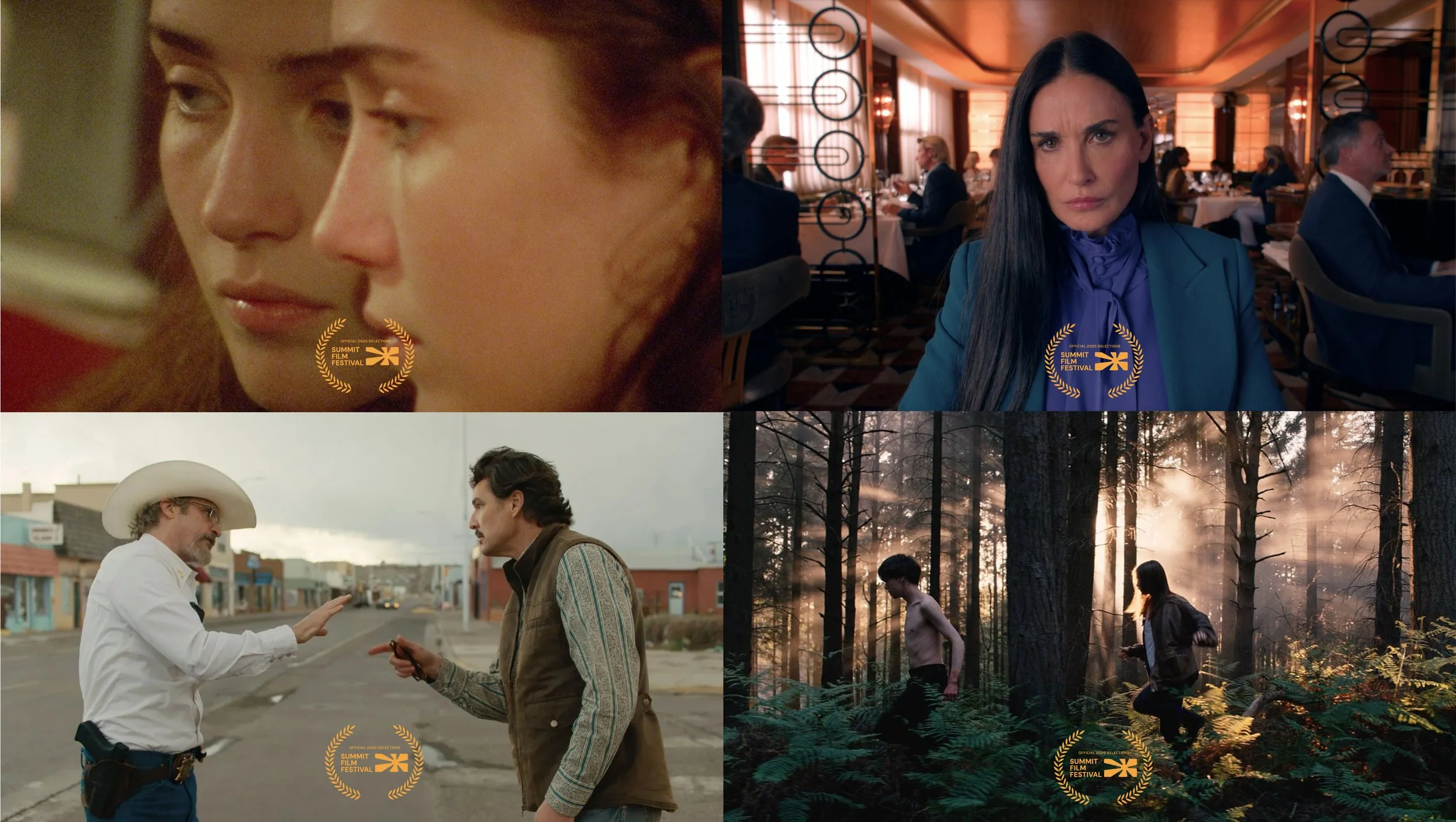
Summit Film Festival is the rebrand of SF Indie Fest, created to reflect a bold new era of independent filmmaking. The new identity repositions the festival as a premier platform for the future of cinema, spotlighting fresh voices, bold stories, and unforgettable audience experiences. Inspired by light projection, emotion, and the way we see the world through film, Summit captures the spirit of ascension and collaboration, where filmmakers and audiences come together to experience the future of film, before anyone else.
Scope of Work
Branding + Strategy
Visual Identity
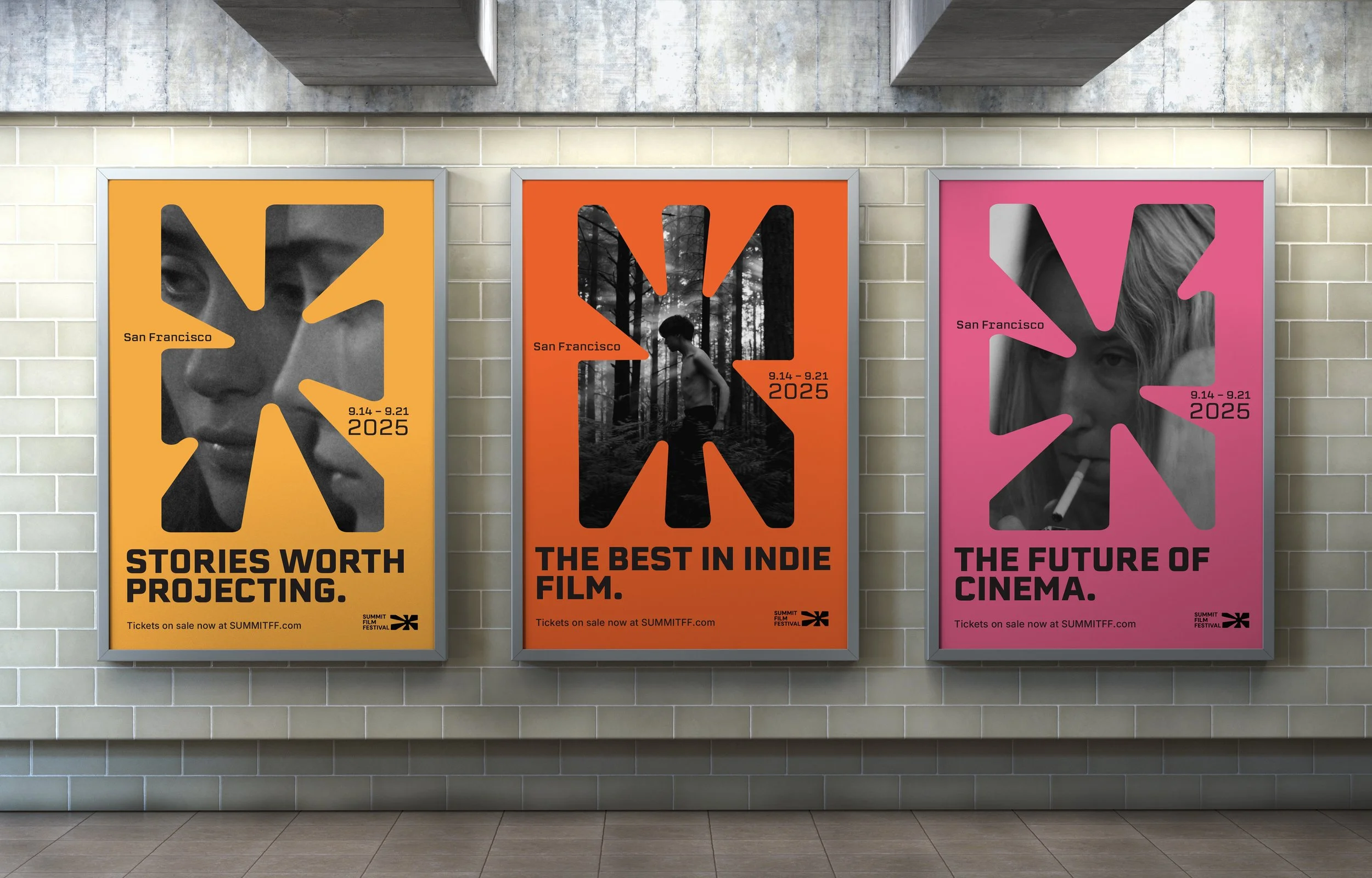
Marketing Assets
Brand Guidelines
Motion Graphics
Copywriting
Video Editing
Tools Used
Adobe Illustrator
Photoshop
After Effects
Premiere Pro
The Problem
SF Indie Fest had a strong local presence but lacked the cohesive identity needed to reach a wider audience. The festival’s black-and-white logotype, inconsistent visuals, and minimal online presence failed to capture the creativity and diversity of the films it showcased. Our goal was to transform SF Indie Fest into a leading platform for rising filmmakers and independent media—one that draws national attention, and fosters a lasting creative community.


Concept + Process
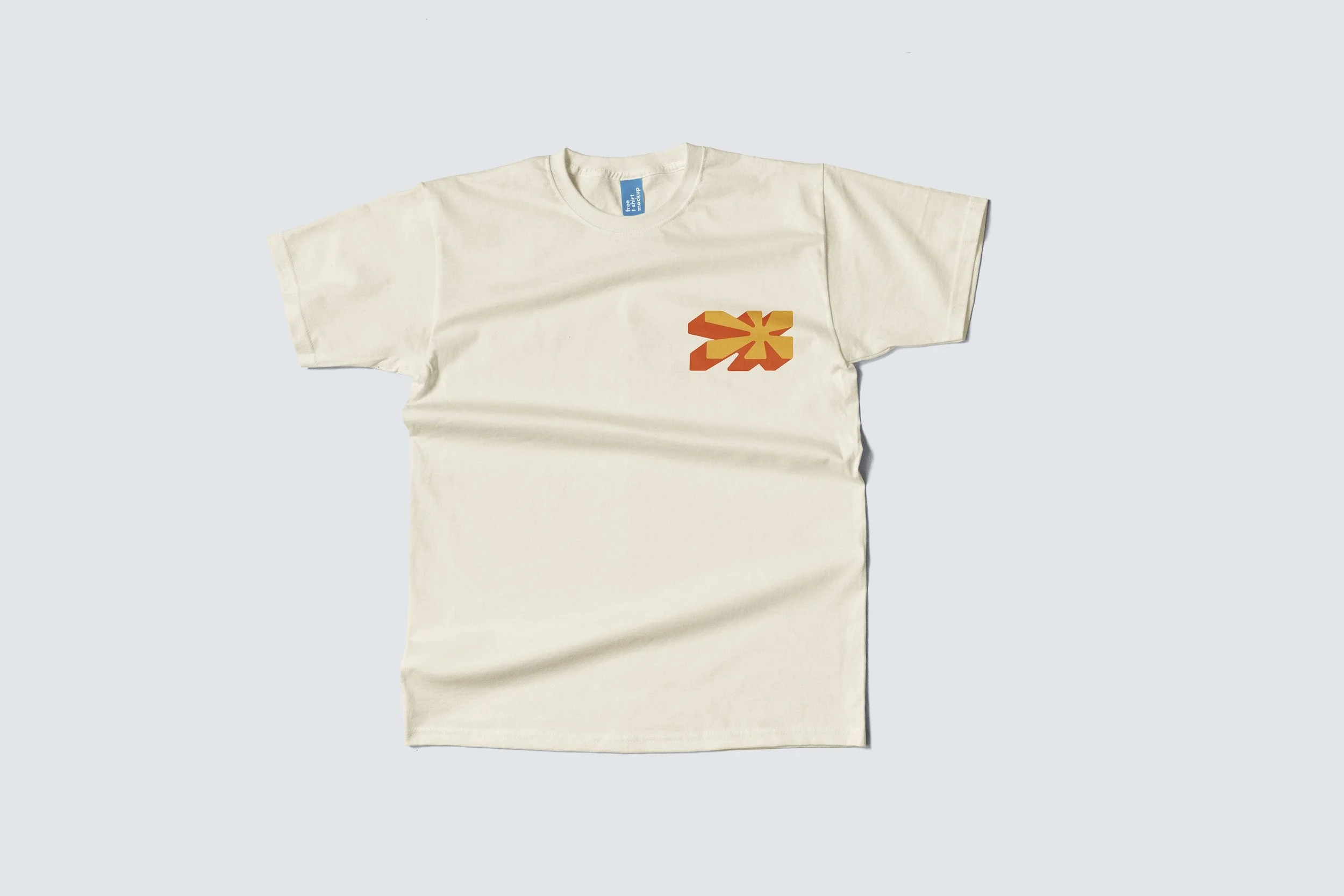
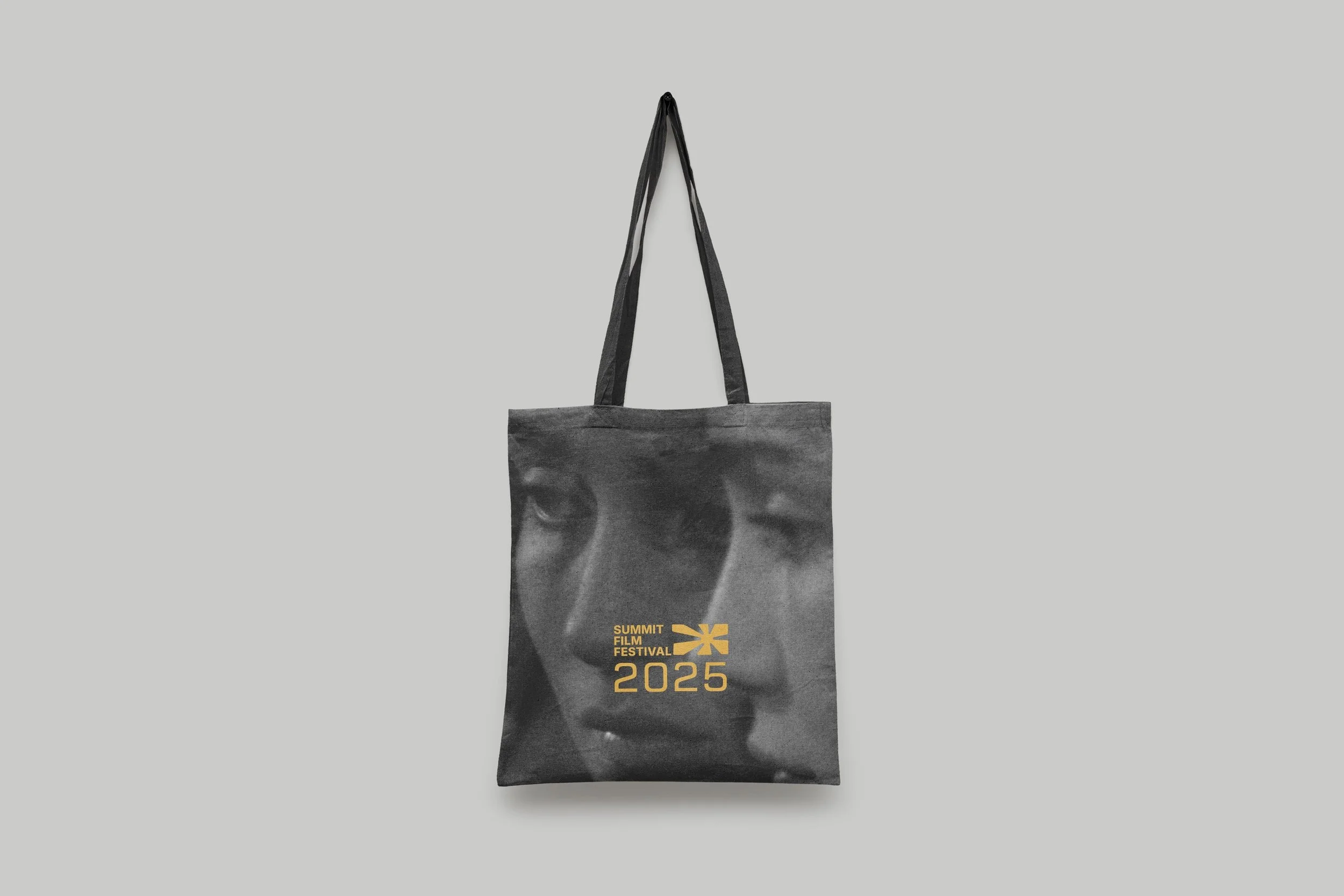
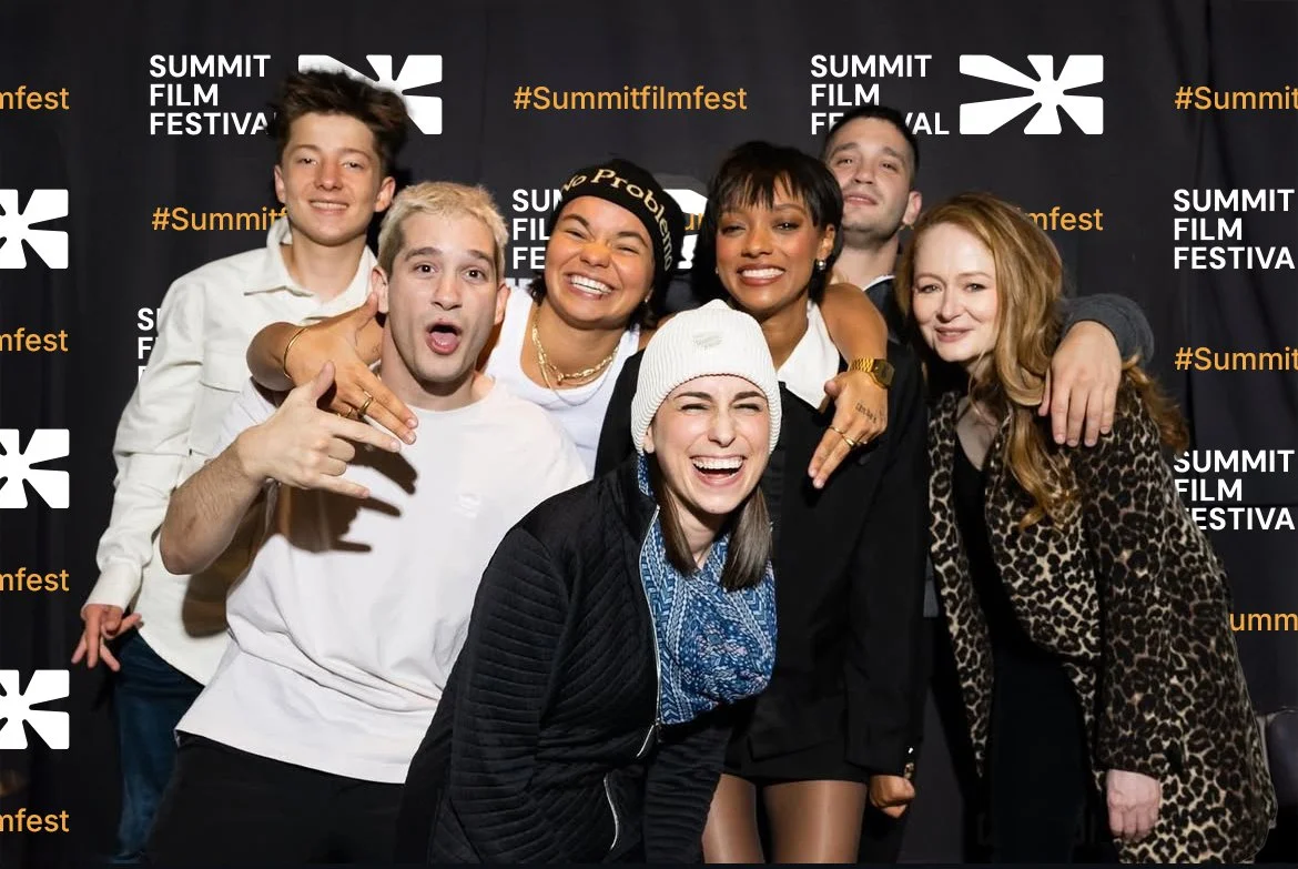
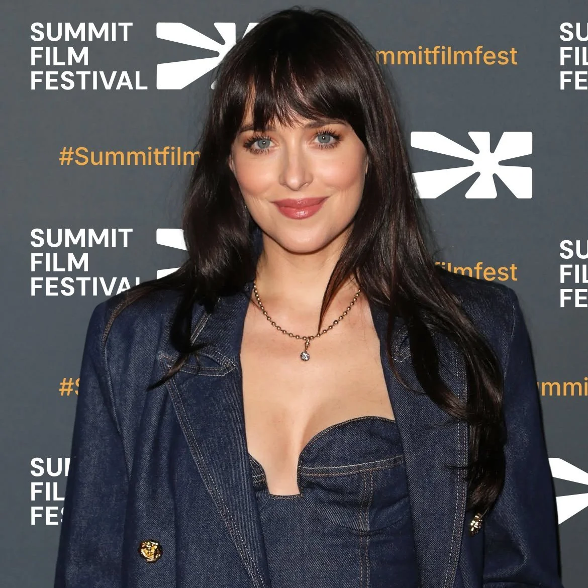
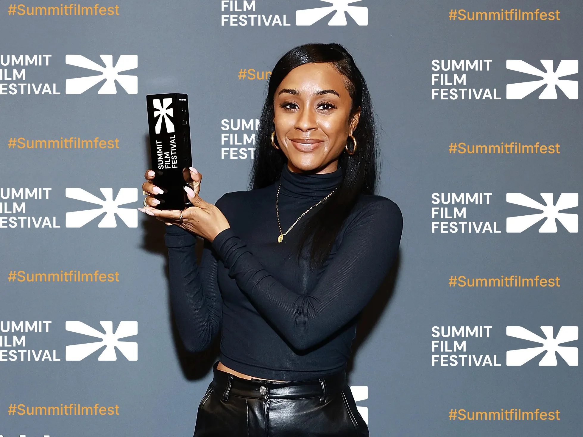
The Logo
The design process began with research and lots of sketches, exploring the themes of light projection and the cinematic experience of storytelling on the big screen. I was drawn to the visual language of film projection—light radiating outward, transforming darkness into image. The final logotype combines a bold wordmark with an abstract icon inspired by that moment of illumination. It symbolizes stories being shared, voices amplified, and creative energy unleashed.
Sketches
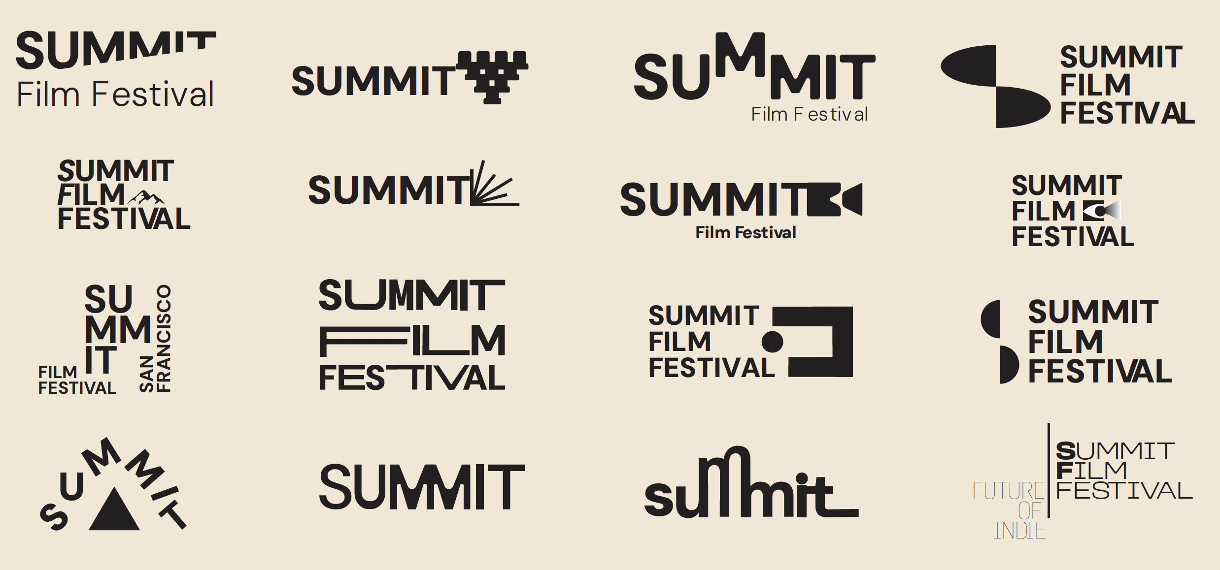

Final Logotype
Creative Direction
To define the visual tone, I developed three moodboards that captured different aspects of the festival’s identity. After gathering feedback, I combined elements from the last two directions to create a refined creative guide that helped me shape the overall color, imagery, and tone of the brand.
Typography
Typography for Summit pairs Erbaum and Inter to balance bold presence with everyday clarity. Erbaum’s geometric construction adds a modern, editorial feel that mirrors the cinematic energy of the festival, while Inter complements it with a clean, legible tone. Together, they create a typographic system that feels elevated, accessible, and distinctly cinematic.


How it all comes together :


The teaser trailer offers a glimpse into the upcoming year of bold films set to premiere at the festival. This high-energy reel is designed to excite audiences, showcase the festival’s unique point of view, and inspire viewers to get their tickets and experience the future of film firsthand.
SUMMIT FILM REEL 2025